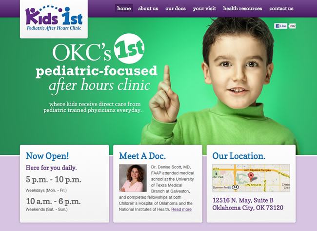
Below is an excellent example of an effective simple home page design. I recently ran across this site and thought I would post it to show how a website can be very effective following some very basic principles.
There are a lot of things done right within this design. First off, it’s simple. There isn’t a ton of clutter to distract you, just simple beautiful color combination with an attractive hero image. In marketing you call this the human factor. Having an attractive human element really draws engagement. Secondly, the message is strong and clear. Many times people forget to explain what their website is about. Upon visiting this site, you know right away that the site is “OKC’s first pediatric after hours clinic, where kids receive direct care from pediatric trained physicians everyday.” Lastly, the 3 boxes below the main billboard is positioned slightly above, breaking the grid, causing more attention to that area for higher engagement.
I will go into more detail into these principles in my web design training course. For more information on this standard website layout and billboard design, check out these two videos below:
The Standard Website Layout
Website Billboard Design Best Practices


Good one Mike! Simple yet talks out loud.
Yes, you don’t always need a lot of bling to make a strong statement. Just effective hero image wrapped together with nice colors and simple layout.
What a great looking site. You nailed everything I thought when I first saw it. Love the colors too. I like how the purple on the bottom is lighter than the top. Makes it feel bigger. Great example.
Thanks Kris, yes I liked this site as an example so much I had to put a video blog together discussing some of the simple takeaways from the site:
3 Web Design Tips for 2012
Just discovered you on the web. Finally someone who’s filling the niche of UI/UX and Fireworks training. Well done.
This site is great on so many levels. Simple rules today, but too many companies continue to spit out websites that are disastrous for us users.
Keep up the great blogs and tutes…
@John S. – Thanks for the positive feedback. Glad you found my site and content. Hope you enjoy it. ;)
It’s looke like the design missing cal-to-action button? I thought this is a mistake?