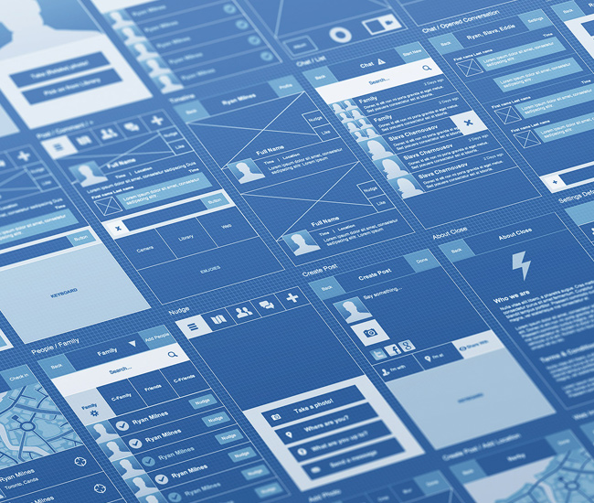
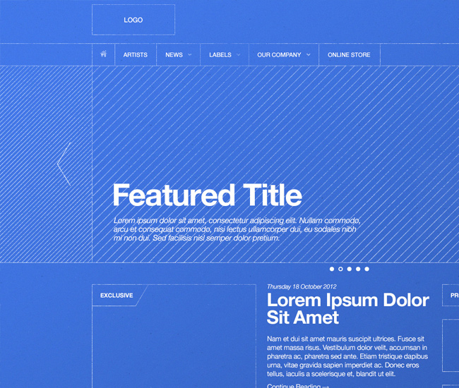
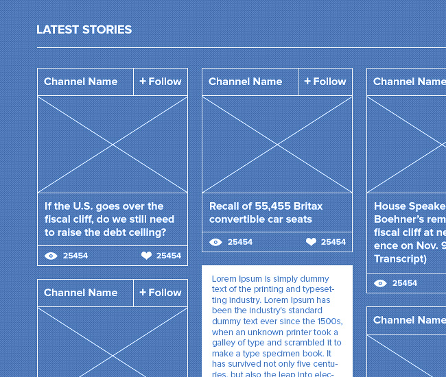
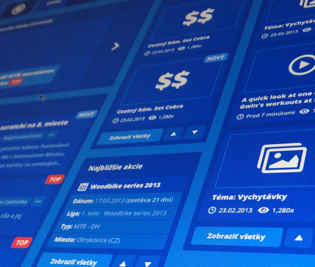
Lately, these beautiful blueprint style wireframes have been catching my eye. I really like the feeling and visual aesthetics of this style of wireframe. Below is a collection I gathered from Dribbble.com for inspiration.
Click on an image below to view detailed shot:
Designer: Eddie Lobanovskiy
Designer: Derek Clark
Designer: Mikael Eidenberg
Designer: Dash
Designer: Waseem Arshad
Designer: Haraldur Thorleifsson
Designer: Andrew Korytsev
Designer: Philip Litassy
Designer: Alex van Zijl
Designer: Ix Techau







Welcome back, Michael. It has been almost a month now since we last saw one of your post. But I gotta say, the wire frames are definitely great. Although what do you think of wire framing in general now? Do you still use the traditional way? Or a different method?
@Brian – Thanks Brian, yes I’ve been on hiatus (vacation, new job, family duties, kids, etc.). But I’m back. Will be producing more blog videos and podcasts as well. Nice to take a break, don’t wanna burn yourself out. ;)
In regards to wireframes, traditional methods are still used for the most part. These blueprint style wires are simply traditional but with enhanced visual appeal. The blue and white is really a nice change from the normal black and white scheme. But for the most part, when working on an large scale project, traditional style wires are definitely still valuable in the early concept phase. I would say the blueprint style wires are great for your portfolio and for that “wow” factor. People really dig this style if you can pull it off.
Just a collection of Hi-fidelity snapshots. Probably converted from existing sites using a tool such as Wirify. What’s the point?
@UXBuddha – If anything styling your wireframes like this adds more appeal to your portfolio. Also, there’s something about the blue/white color scheme that comes off really well to the eye. Haven’t tested anything, but I’d say that it could be an improvement from a visual/readability standpoint. The soft blue and soft white tone that is.
I love them. Been eyeing them for a while too. I like blueprints in general. Such an amazing workflow architects must have. I agree good for a wow factor. As a client I think I’d prefer B&W.
Hiatus? New job? You’re not at Yahoo anymore? And I get the blue/white color scheme issue. It does work well.
@Kris – Yes, wireframes like this is great. I wish I had more time to focus on creating stuff like this. Would be fun. True about clients might just prefer B&W, but the blue is great for portfolio candy. ;)
@UXBuddha – Yeah, left Yahoo! a while back, just recently switched jobs, currently working with ADP (doing UI/UX design on their business applications). I tend to switch jobs a lot (which is not good) …but you gotta do what you gotta do. ;)
Good to see you back, Mike. It’s probably good that you too a break. I’m going through 1-2 of your blog posts each day so I can catch up ;) I want to watch all of the videos.
Your website is such a great source of information, that I added a link to if from my resources page at:
http://www.mrtechnique.com/useful-web-developer-links/
Thanks Tom, yes taking a break is great. Glad you enjoy my site and content.
Mike! Great to to hear from you…I have been waiting and anticipating for your new posts….cant wait for friday’s best! Glad to see all is well! I really love these examples…this is one part of my game I need to do better at…this is just what I needed to see!
Your posts and videos are extremely helpful, thank you again Mike
Based off a different video of yours that I saw, I developed a style of laying out each project for my portfolio as such.
1st pic. Image of any/all drawings related to site.
2nd pic. FW wireframe(grey scale) & prototype(color)
Remaining pics. couple images of site.
Mike! I love this example it blue my favorite color. I need this example in my portfolio. Just continue to keep it coming.
I really loved this. Thanks again!