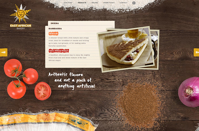
This week’s favorite website goes to East African Bakery. I love this site for its strong brand awareness through authentic visuals, textures and images. This site does an excellent job at connecting with the user and really pours out authenticity throughout the site. Very well done.
Click on a screenshot to see full-size:


Nice website, i really like these new kind of layouts, they give a great personality a website. Hope we will have a tutorial on that soon. Bazinga
@Madere – This would make a great tutorial. But I like to look at these sites for the brand impression they give off versus the functionality. I don’t worry too much about the unique scrolling. Whether the site scrolls to the left or scrolls down normally doesn’t really matter to a customer. I think the bigger focus should be on the overall brand. The look and feel of this site can be accomplished with simple static HTML/CSS. I like to approach these sites as types that can be accomplished with simple code, but in the end help make lots of money for the company through effective branding.
Yeah you are right Mike the branding on websites like that is powerful, the impact is always bigger, seems to work better with companies with small product line. I will try this on a potential to see the results.
Hey Mike, Wow, this is an excellent use of color and it combines all the ingredients of the product be marketed all on one page. Great find! Looking forward to learning Fireworks!
Hello Mike,
I really love this website and hope that one day i will be able to build one like this.
Thanks for sharing!
@Madere – Exactly, a site like this would be nice for a smaller company with a small product line. Nice brand impact for sure.
@Ron – Thanks buddy for the feedback.
@Genevieve – Designing a site like this is totally doable. A good place to start is to take one of these screenshots and try to duplicate it. You’ll find out through the process what it takes to design something like this. Just practice. Overtime, it will come.
Hey Mike. This is a great site. I can see why you chose it. You are right about the strong brand identification. The choice of colors are rich and right on the money. Even the fonts they chose melds very with the look and feel of the site. The only thing I would worry about is how slow it loads because, I assume, of the large images they are using. Is there a way to counteract that some how? You can only optimize images down so much.
@Lisa – Good call on the large images. You can only “optimize” images so much. But I don’t think its a problem with this site. Smaller sites like this are positioned mainly for branding purposes. Most of their business transactions are done in-store versus online. That being said, its not that bad of an experience for someone to have to wait a few extra seconds for an engaging brand presence. Now this would be different if this site received a ton of traffic and made most of their money online. Large images wouldn’t fly on yahoo.com, facebook.com, cnn.com, etc.
Please let me know if you’re looking for a writer for
your site. You have some really great posts and I think I would be a good asset.
If you ever want to take some of the load off,
I’d love to write some articles for your blog
in exchange for a link back to mine. Please send me an email if interested.
Cheers!